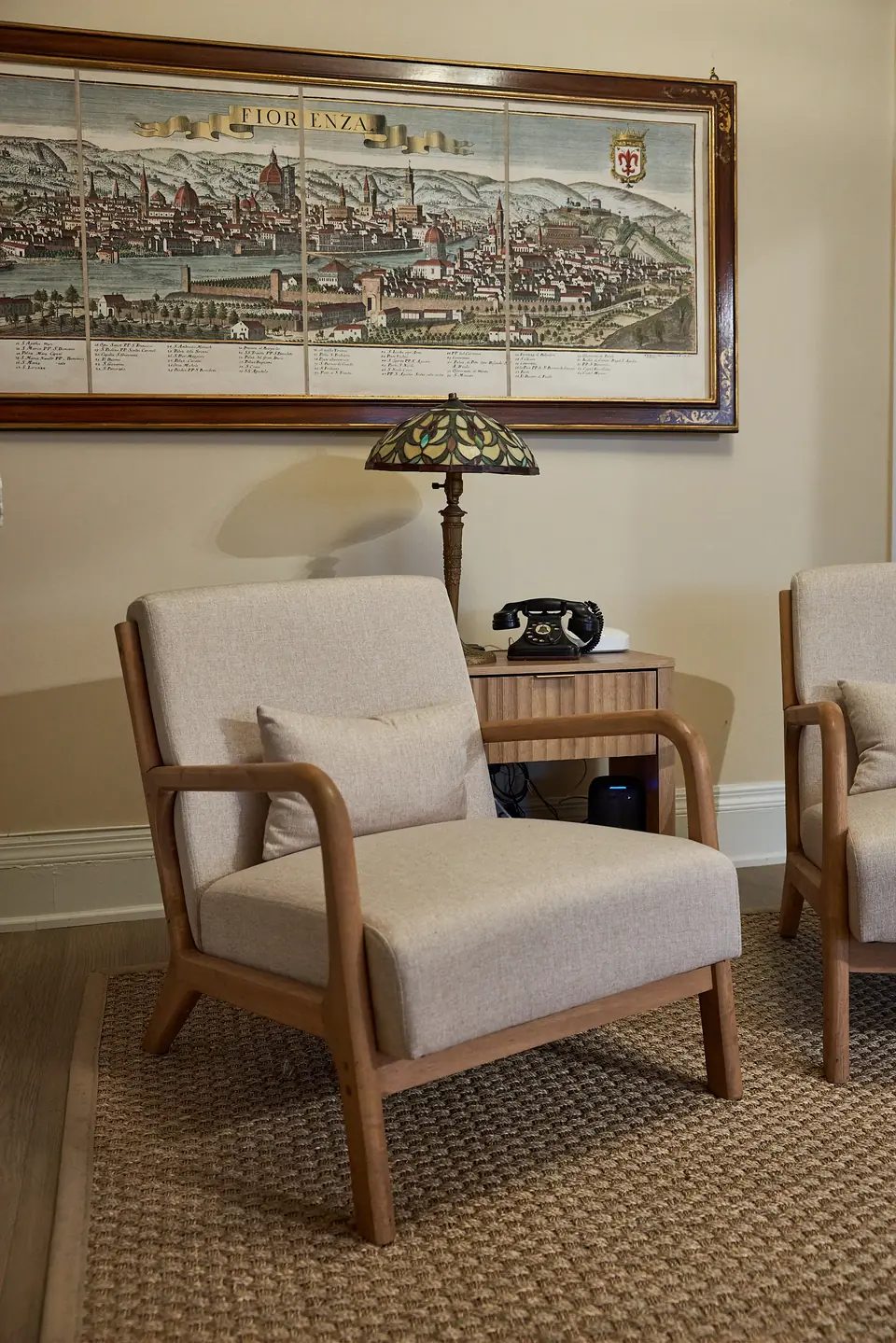
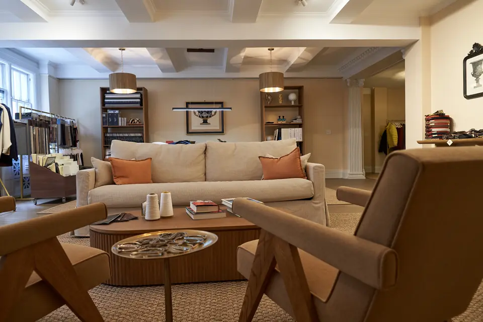
Light Background — New Directions
Exploring a lighter, more open feel for the website. These palettes take the tonal families that resonated — Tuscan Earth and Victorian Noir — and reimagine them for light, airy layouts alongside fresh new directions.
Light, editorial layouts with generous white space — inspired by the clean sophistication of Canali and Cesare Attolini’s web presence, the understated elegance of Montblanc, and the warm textures of the Manhattan showroom.
Tuscan Earth tones — espresso and terracotta — on a warm ivory canvas. Dark accents ground the page while the light background lets photography and content breathe.
Inspired by: Tuscan Earth tones · Cesare Attolini editorial · Once Upon a Time in America
The stark black-and-bone contrast of Victorian Noir translated to a light parchment base. Monochrome with no color accent — typography and imagery do all the work. Clean, bold, modern.
Inspired by: Victorian Noir tones · Montblanc minimalism · Taboo’s stark contrast
Warm cream background with deep navy headings and brushed gold accents — like a luxury fashion editorial spread. The contrast is sharp yet inviting, professional but never cold.
Inspired by: Canali navy suiting · James Bond sophistication · Boardwalk Empire elegance
Heritage Gold reimagined on a warm white canvas — bridging the gold preference with the light-background direction. Amber-gold accents on clean ivory with dark headings for anchoring.
Inspired by: Heritage Gold tones · Peaky Blinders warmth · Cappellificio Biellese