Heritage Gold — Expanded Directions
Lana Royale — Heritage Gold Variations
Heritage Gold emerged as a preferred direction. Here are four variations exploring different warmth levels, contrast ratios, and accent intensities within that golden family.
Heritage Gold — Expanded Directions
Heritage Gold emerged as a preferred direction. Here are four variations exploring different warmth levels, contrast ratios, and accent intensities within that golden family.
All variations stay within the warm amber-gold family inspired by Peaky Blinders' cinematography, Boardwalk Empire's Art Deco interiors, and the rich tones of the Manhattan showroom's brass and carved wood details.
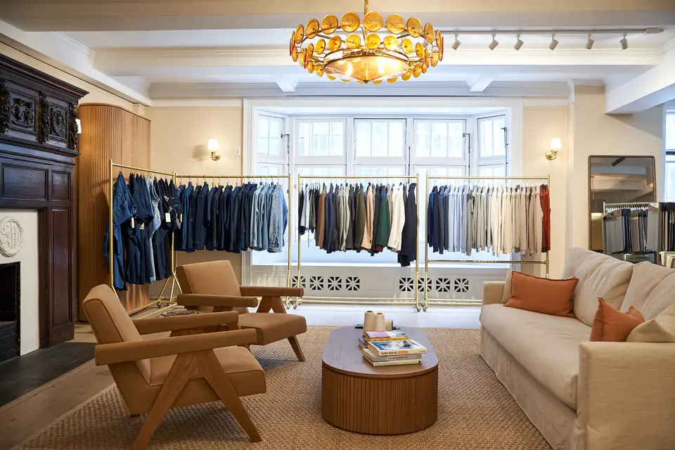
The original Heritage Gold as presented — warm amber and antique gold drawn from brass sconces and carved dark wood. The baseline direction that resonated most.
Inspired by: Peaky Blinders amber glow · Boardwalk Empire Art Deco · Cappellificio Biellese
A softer take with a lighter cream background, muted gold accent, and more breathing room. Less dramatic contrast — feels more like linen and morning light in the showroom.
Inspired by: Once Upon a Time in America pastels · Cesare Attolini warmth · Italian linen
A richer, deeper interpretation with darker primary tones and a more saturated burnished gold. Higher contrast for a more commanding, authoritative presence.
Inspired by: Peaky Blinders smoky interiors · James Bond gold titles · Montblanc precision
Shifts the gold toward warm bronze and copper — less yellow, more reddish warmth. Feels more intimate and artisanal, evoking Tuscan workshops and hand-finished leatherwork.
Inspired by: Tuscan earth tones · Public Enemies warmth · Italian artisan workshops